The Design of Moth
It wasn't a difficult decision to write a story with Moth as its protagonist – He had already crept his way into my heart while I was working on Lovewood, and by the time I thought more about his past and personal struggles for Frightwood, I had fallen very much in love with him. He is an ambitious perfectionist, but also carries his heart on his sleeve and cares deeply for the people around him.
For Invisible Seams, I had saved his sprites for last, and it was a good choice! He is the most complex out of the entire cast, and I wanted to be ready so that I could do him justice.
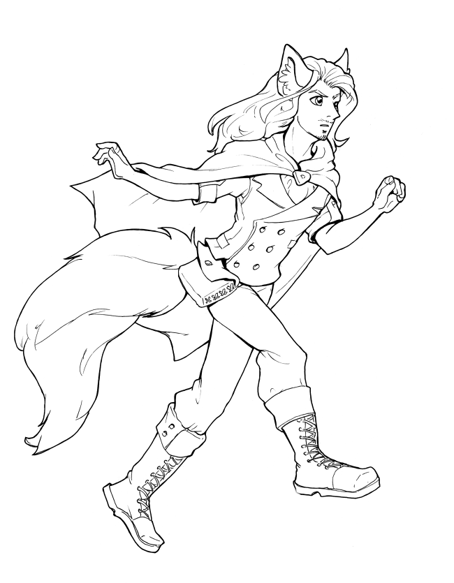
An expressive protagonist
I personally find it easiest to relate to character when they're expressing their emotions through their face and body language, so it was a huge focus for Moth's sprite. It's why I'm a fan of Renpy's layered image feature; It allows you to build very intricate and granular expressions, instead of being limited to the standard happy/sad/neutral/scared. When I talk about sprite complexity, that is the metric by which I measure it: How many individual files come together to create these varied expressions? For some of the simple supporting characters in Invisible Seams, they have 30 or 50 image files. For Moth's kit, it was a whopping 290. This includes his different poses, all his eye variations, hand gestures etc.! It's a bit of a hassle to sift through all these parts in the interactive director, but as usual, smart organization and naming conventions make life easier.
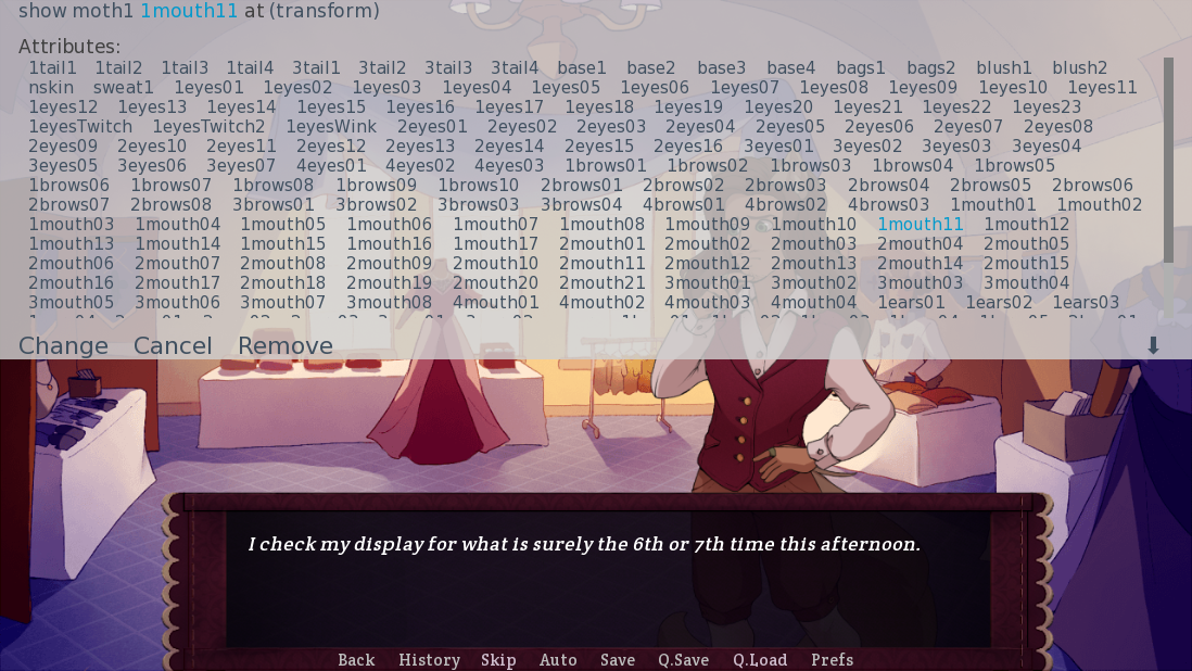
This is fine.
In search of outfits
Characters always exist in contrast to each other. Moth may be one of the fanciest-looking fairies in Liebwald, but when faced with the Guild in Fitzburg, his appearance couldn't be so flashy that he would out-posh characters like Jasper. It would have clashed with the theme of him being an underdog among elitists. Cue a lot (and I mean a LOT) of sketching and trial and error until I figured out a proper balance for his main outfit.
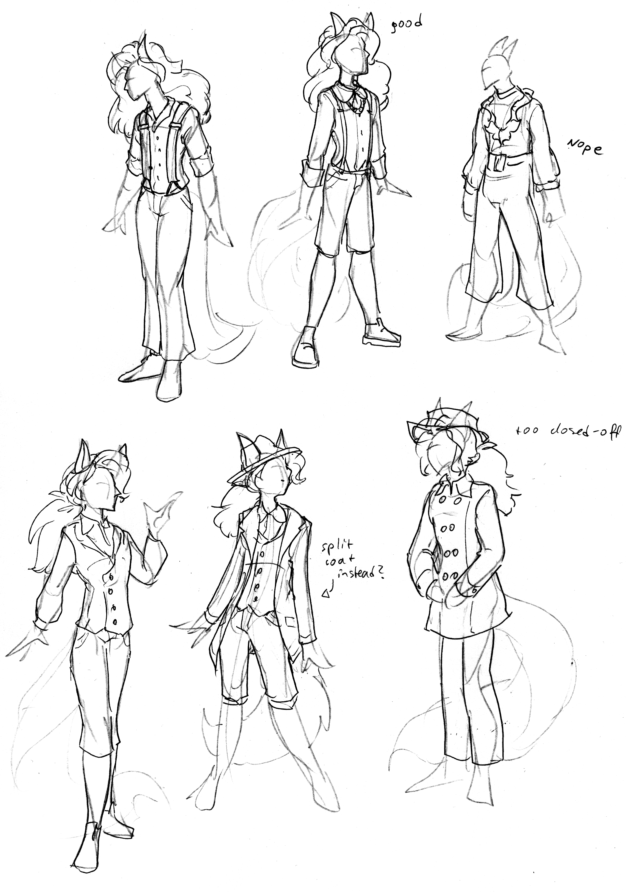

What I settled on was something that looked simple, but well-made: a shirt and vest combo in warm, comforting colours (the beige and mauve always remind me of red berry pudding with vanilla sauce for some reason), with rounded cuffs to further soften his appearance. For his traveling outfit, I picked something rather self-indulgent: An open coat with a vest underneath, and a neck ruff inspired by the understatement style of Beau Brummel. I also couldn't resist to give him the ponytail hairstyle in this, because I have been obsessed with it ever since I realized he could wear it like that. (Can you tell I've had short hair all my life? Yeah....)
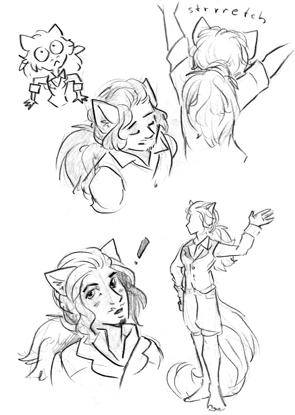
Finishing touches
Usually I don't like to go back and edit sprites, but in Moth's case, I took the time to sharpen his jaw a bit more, since I felt it looked too round on the first pass, and I also darkened his hair and facial hair for some extra contrast. Would anyone even notice changes this tiny? I don't know, maybe not, but I suppose I'm a bit of a perfectionist myself B)

We got one more design dev log coming up, so stay tuned for that! That one will be about our favourite two fairy ladies, Kaileen and Blossom <3
- Dev
Get Invisible Seams
Invisible Seams
A visual novel about soft fabrics and even softer boys
| Status | Released |
| Author | LadyIcepaw |
| Genre | Visual Novel, Interactive Fiction |
| Tags | Amare, Cute, Fantasy, Furry, Gay, LGBT, Romance, Story Rich |
| Languages | German, English, French |
| Accessibility | Subtitles, Blind friendly |
More posts
- Invisible Seams is now available in French! - Update 1.366 days ago
- Autumn Sale (50%!) on everythingOct 27, 2022
- Bonus art!Aug 27, 2022
- The Design of Blossom and KaileenAug 23, 2022
- The Design of CaesarAug 18, 2022
- The Design of JasperAug 15, 2022
- Tips on making your VN more accessibleAug 12, 2022
- Changelog Demo 0.7.1Aug 11, 2022
- Full release!Aug 10, 2022
Comments
Log in with itch.io to leave a comment.
Now I want a complete list of Moth's attributes!
And for me personally long hair is a hassle - so hairstyle is something very individual.
It's a lot XD I actually made separate sprites for each of his outfits, to keep the Interactive Director somewhat manageable, and the amount of layers and different attributes varies between them. I think his most complex sprite has 10 layers!